


Yoke Apparel
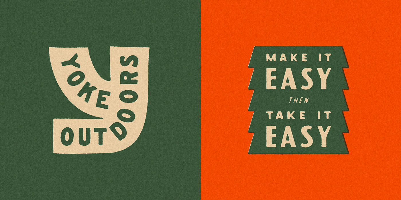
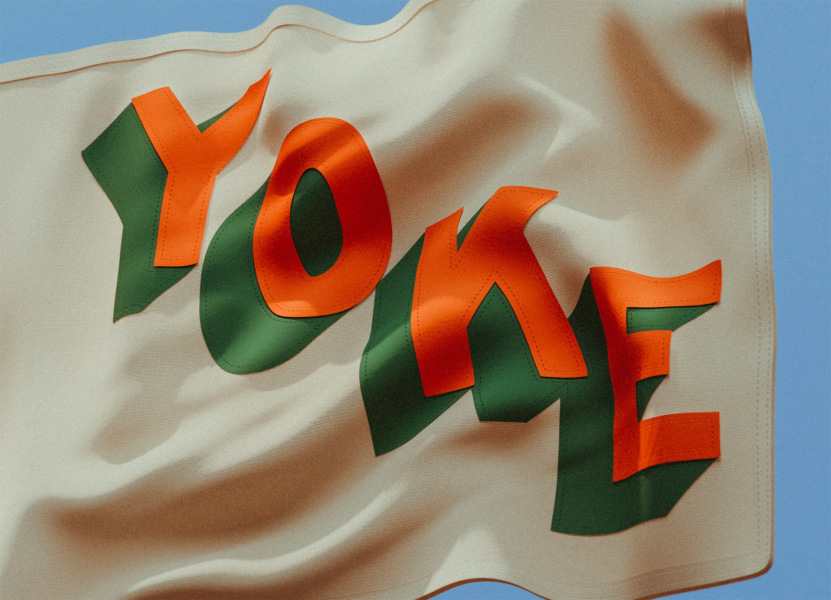
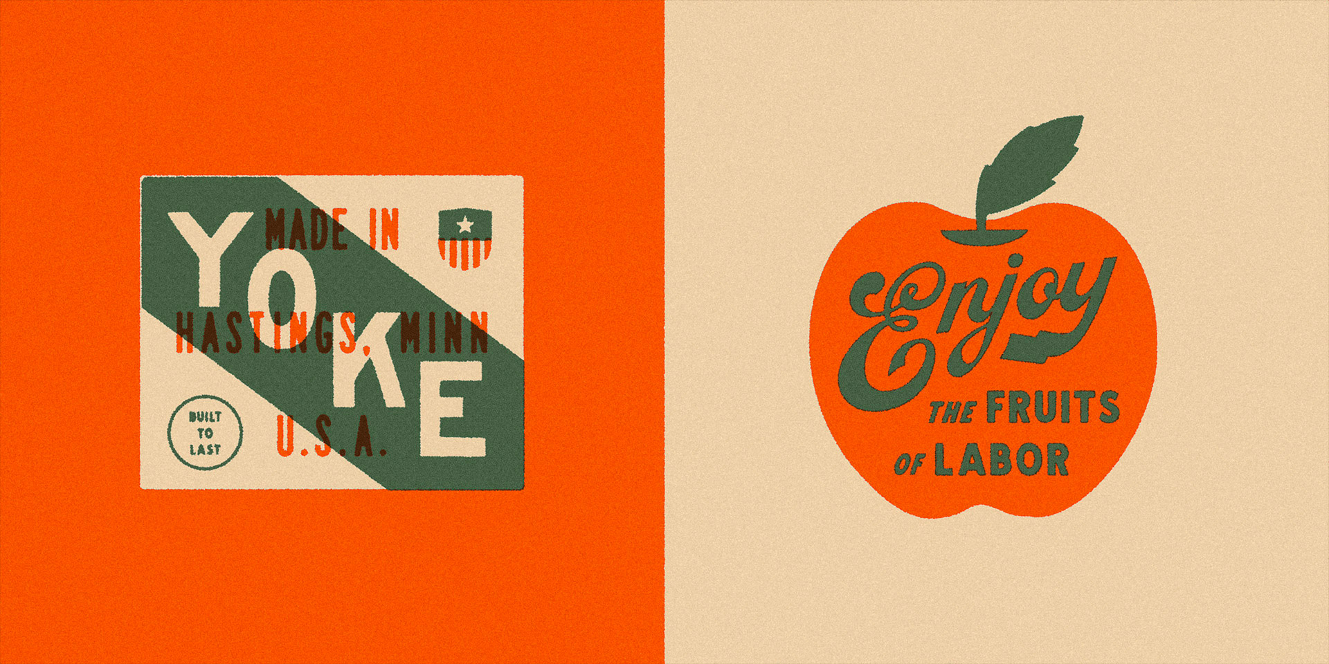
Developed a bold, heritage-inspired visual system for Yoke Outdoors, an apparel and lifestyle company rooted in weekend culture, craftsmanship, and the joy of the great outdoors. Using Photoshop, Illu...
Print Design, Branding, Apparel, Packaging
/25
INSPIRATION
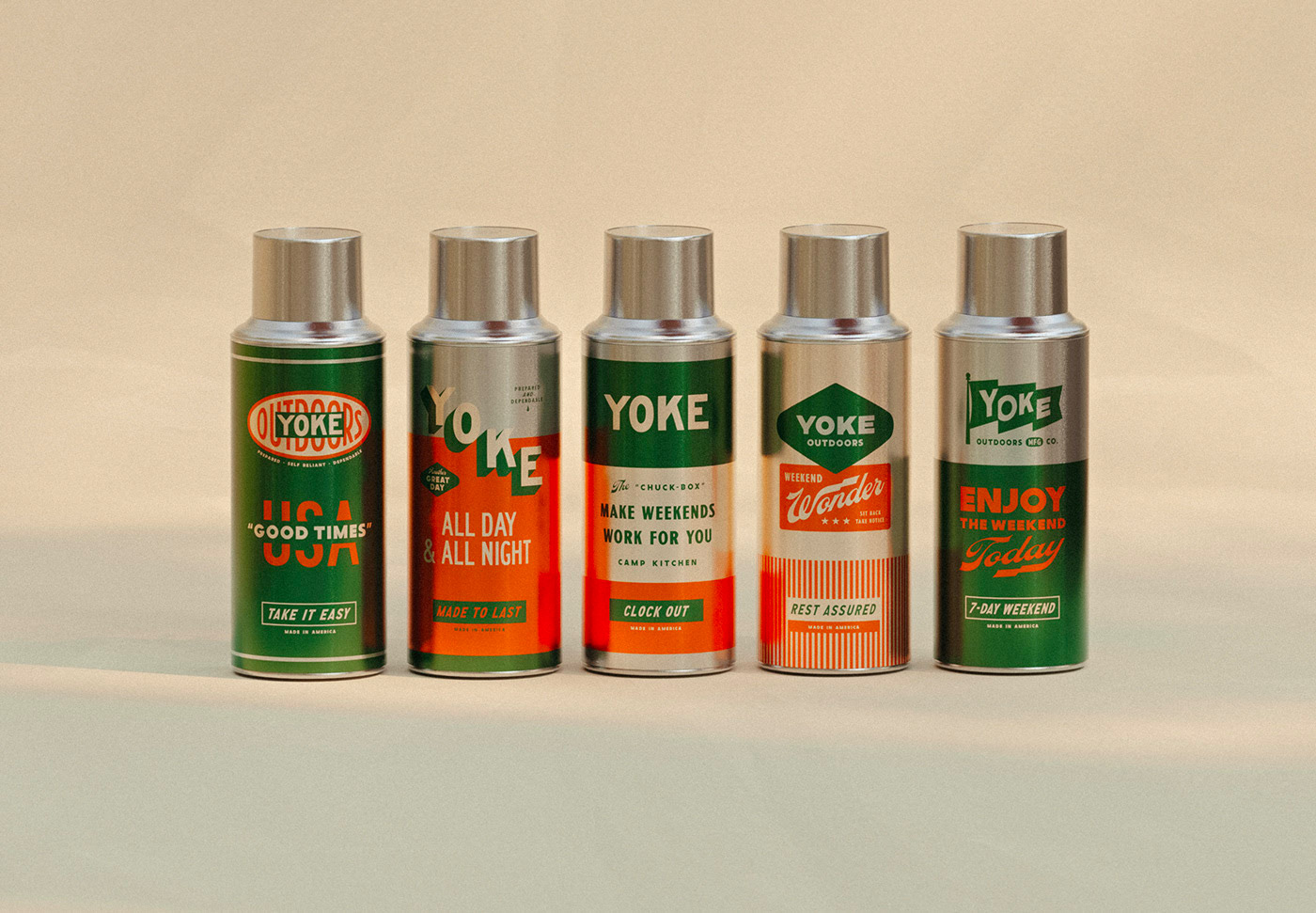
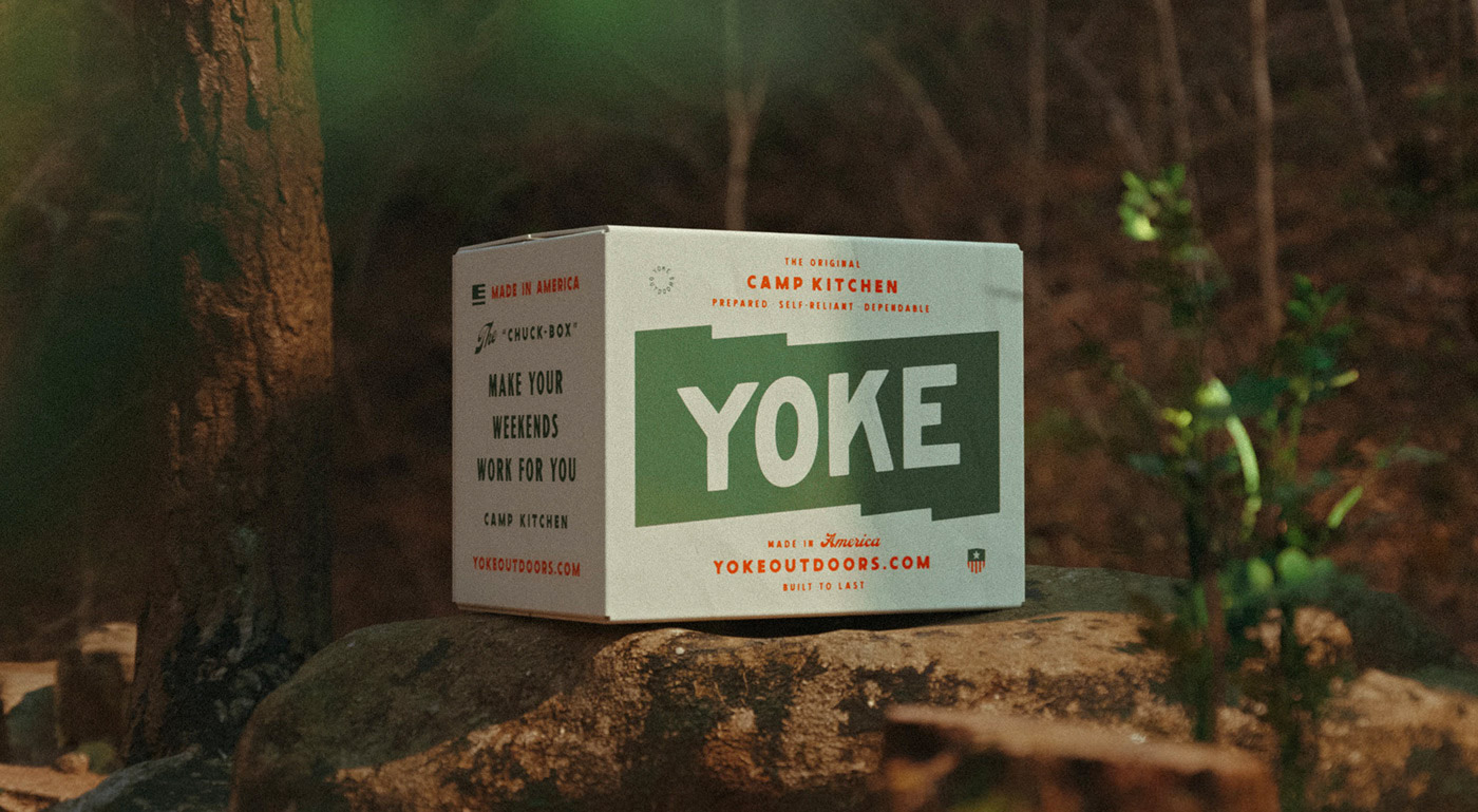
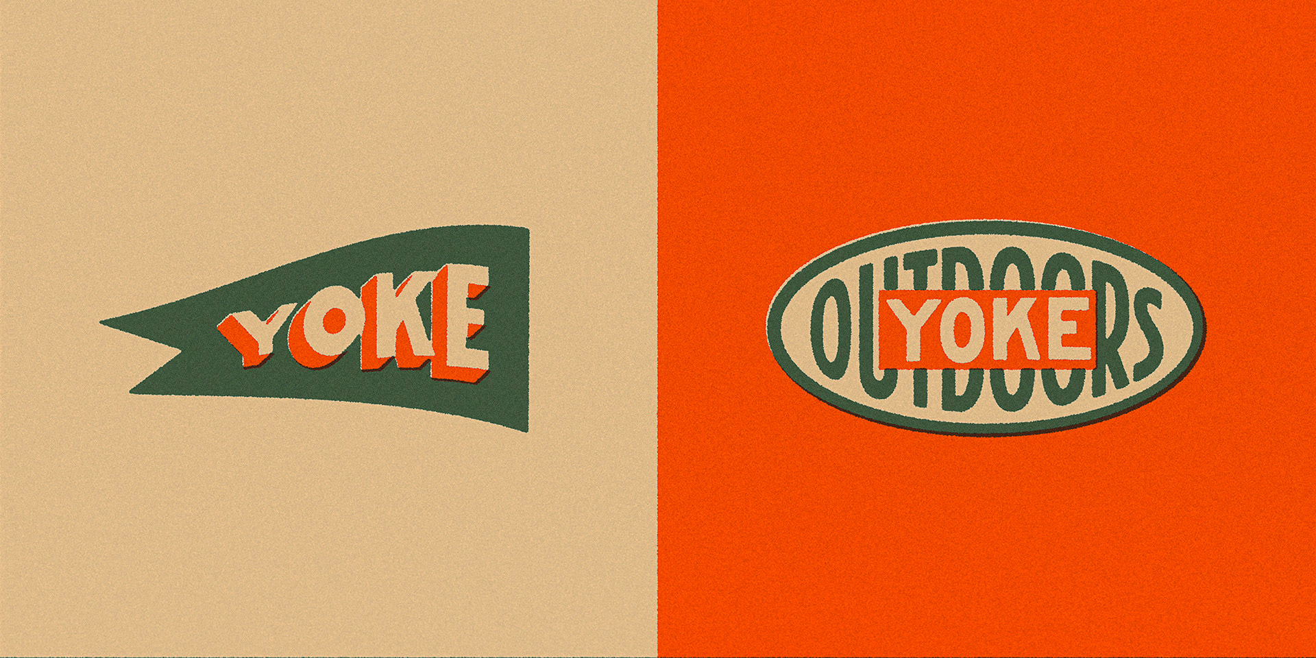
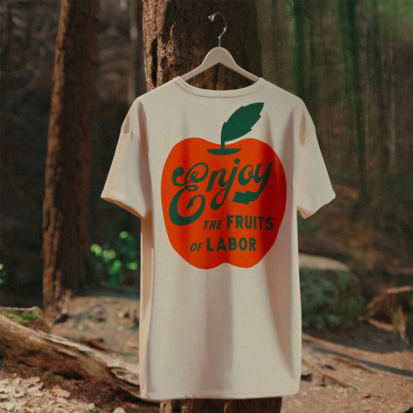
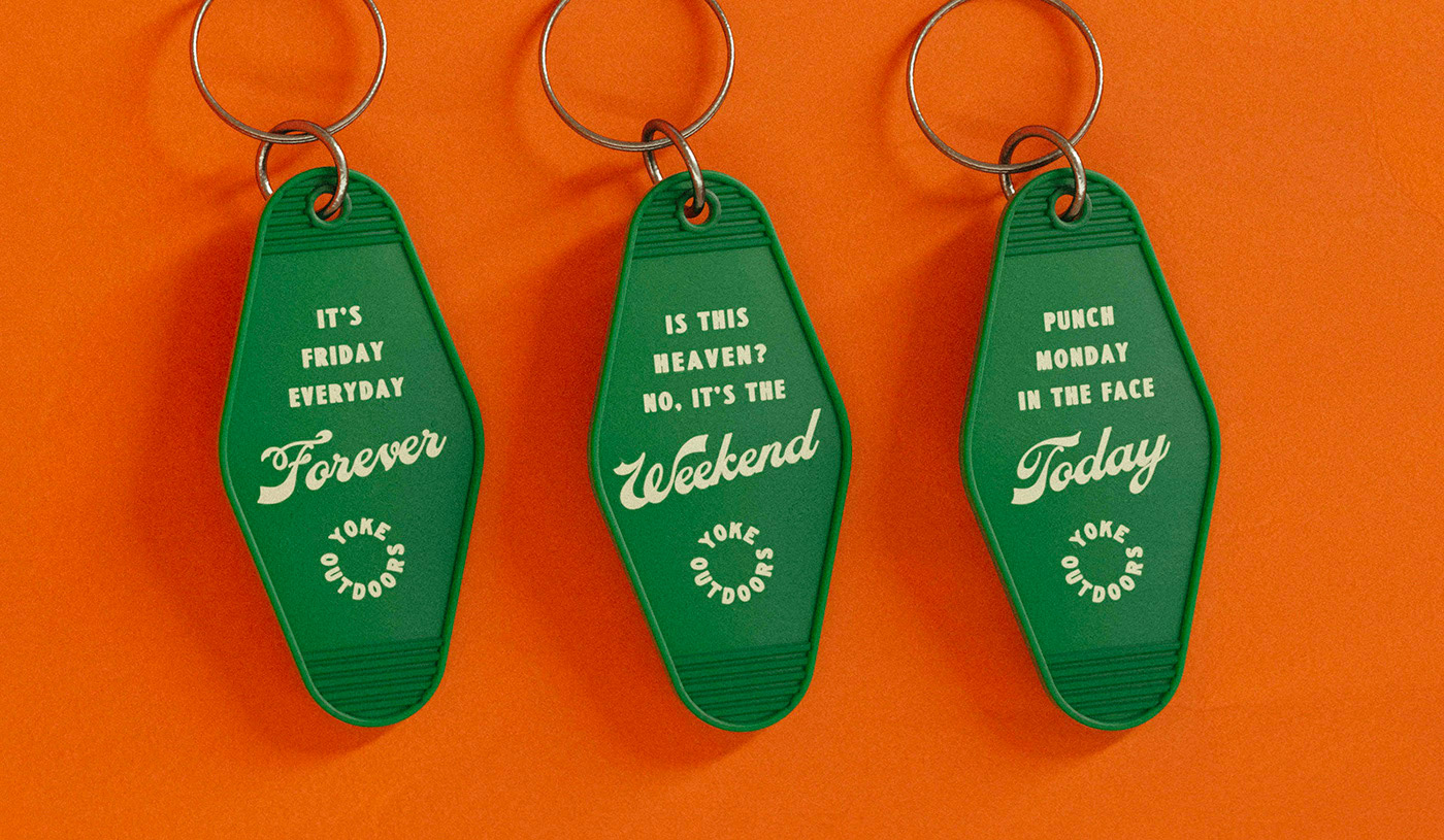
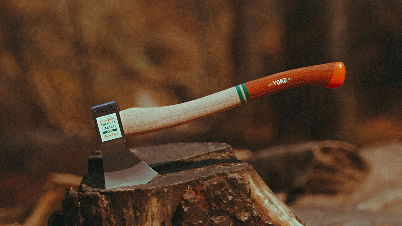
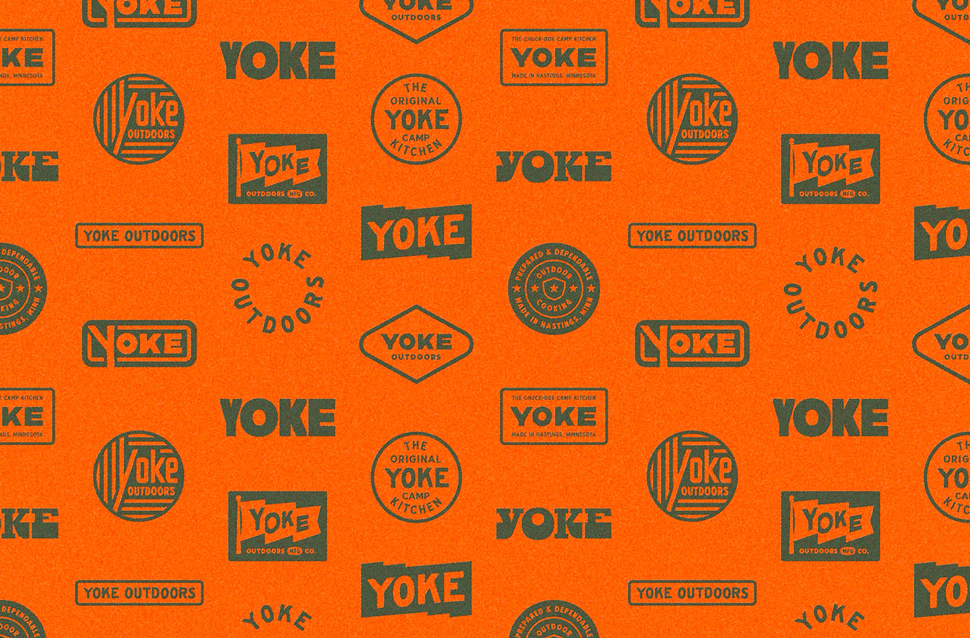
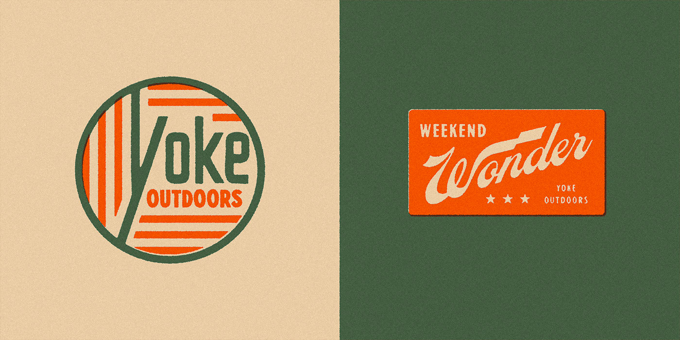
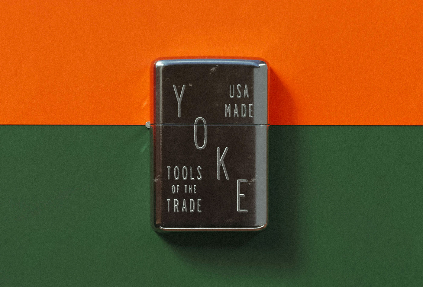
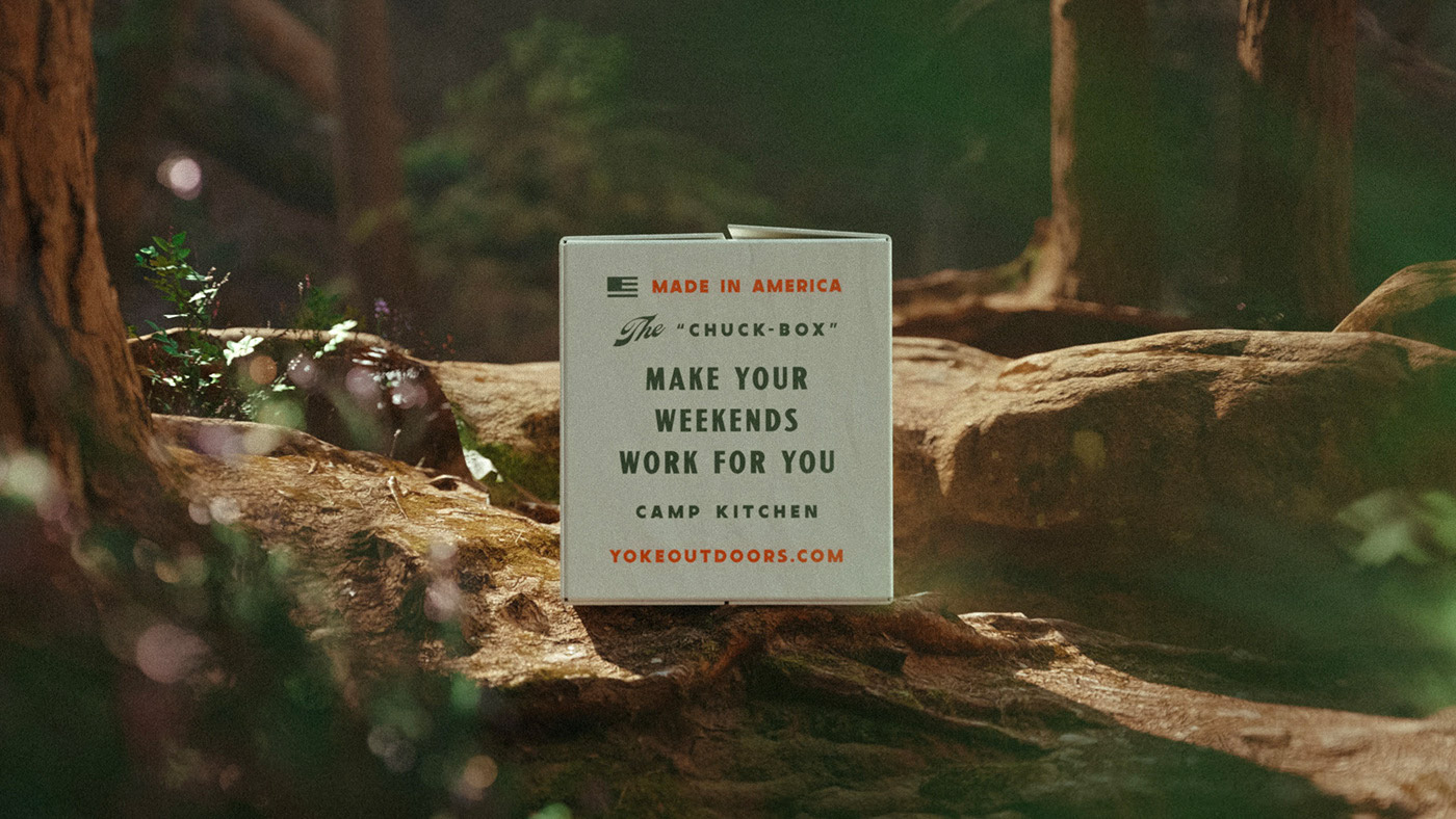
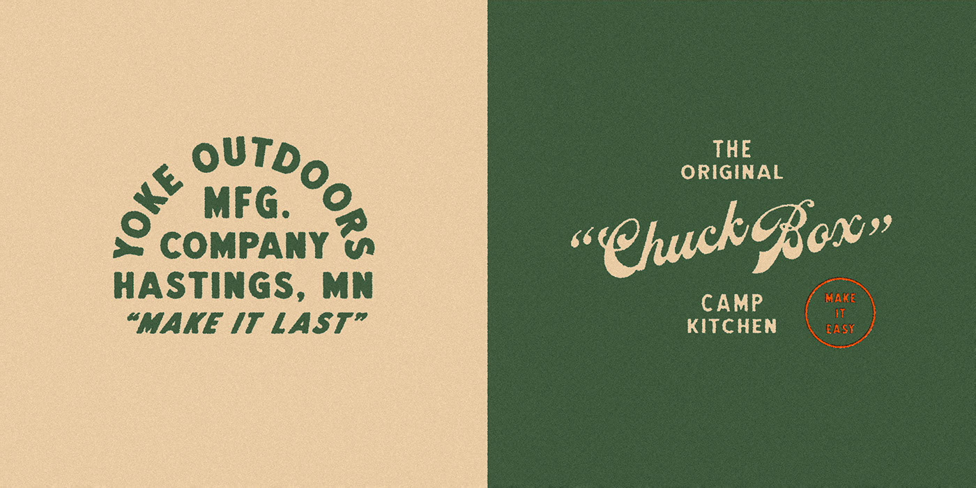
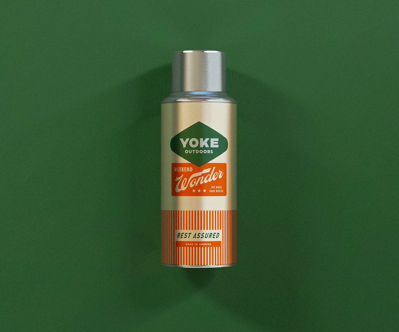
Developed a bold, heritage-inspired visual system for Yoke Outdoors, an apparel and lifestyle company rooted in weekend culture, craftsmanship, and the joy of the great outdoors. Using Photoshop, Illustrator, and InDesign, I designed a cohesive collection of graphics, apparel applications, patches, labels, and packaging elements that embody the brand's rugged, nostalgic character. The work included typography-driven marks, product-focused illustrations, and a warm, Americana-styled color palette that connects with Yoke's emphasis on durability and everyday adventure. The final identity extended seamlessly across apparel, accessories, and retail materials—creating a memorable, unified brand presence that celebrates leisure, utility, and the spirit of the outdoors.
message
Fun colors and shapes can change our perception of mistakes. Thanks to the Space Grotesk typeface, designed by Florian Karsten in 2018 and featuring numerous stylistic sets, we can see how typographic glyphs themselves are shapes resulting from years and years of mistakes and failed attempts to make writing more beautiful, faster, more readable, or more original.
Premium, but not snobbish
Starting with a very strong graphic concept, a parallel growth, the line becomes the protagonist of the visual identity. A line that grows, connects and marks a path both for the eye and the mind.