Mama Chens
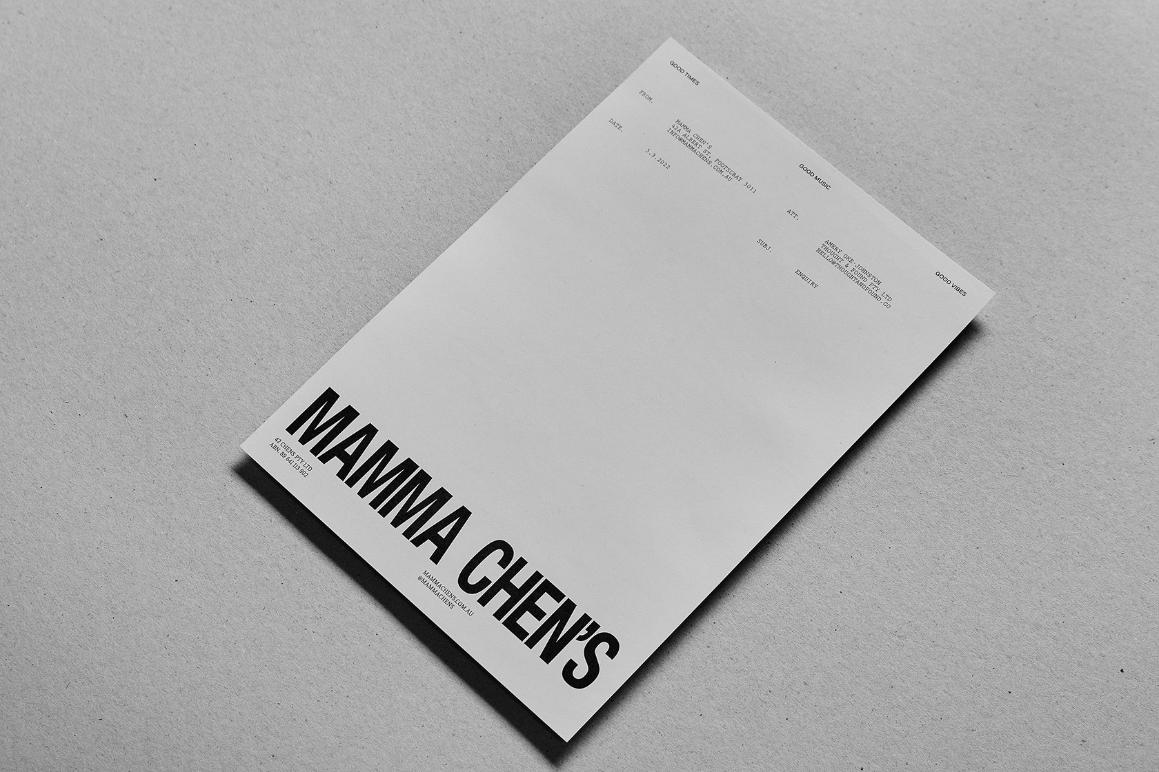
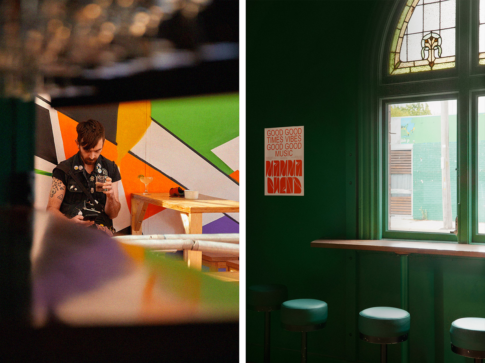
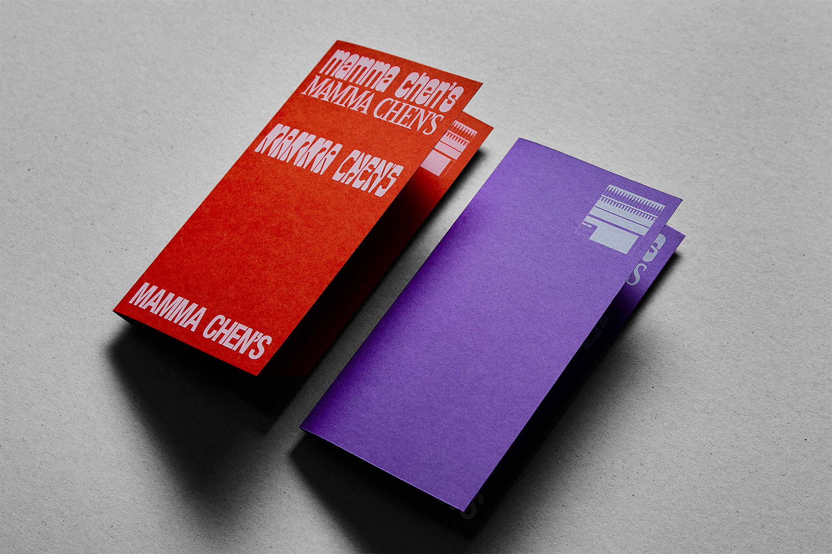
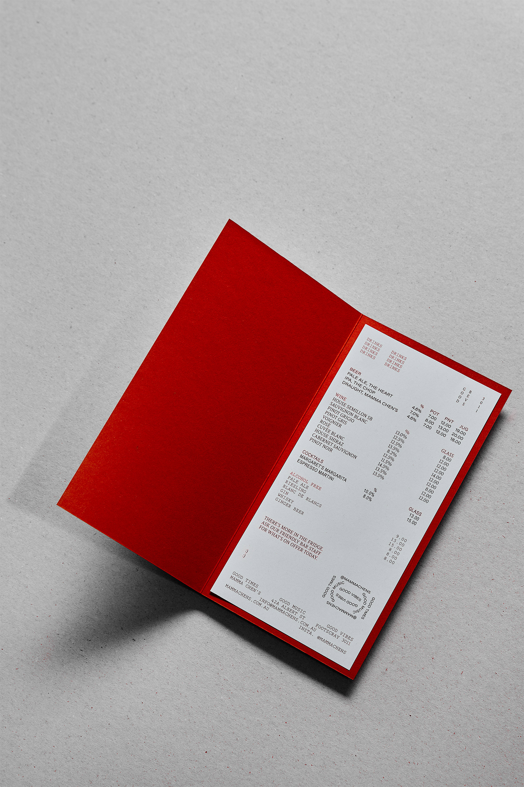
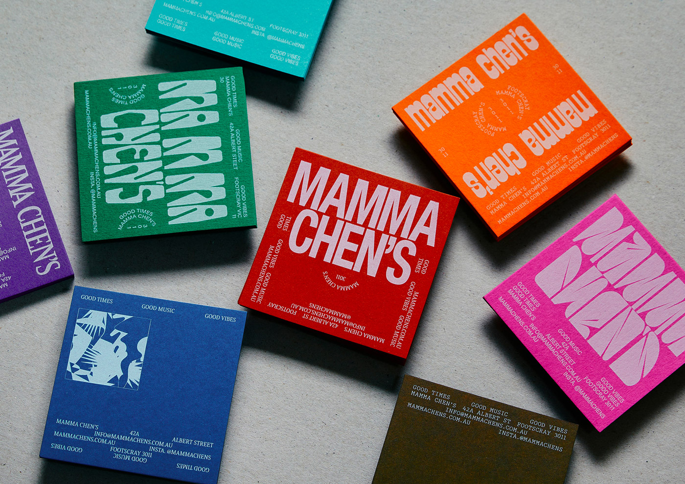
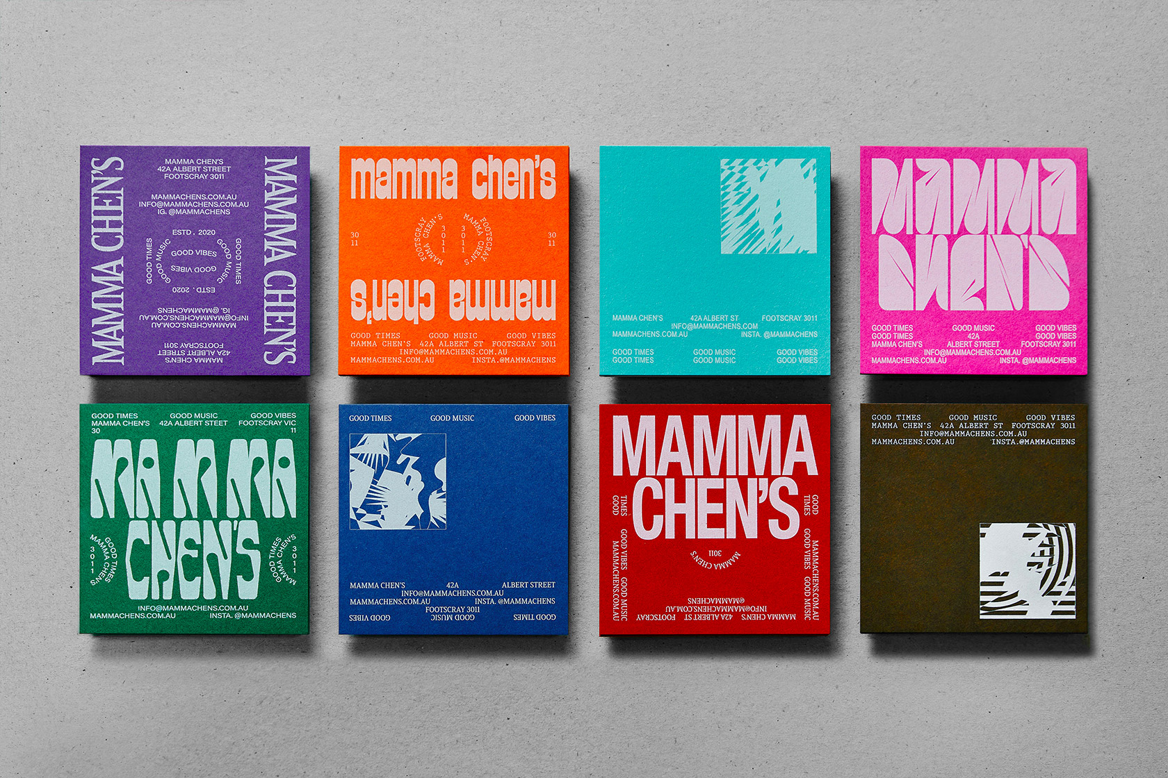
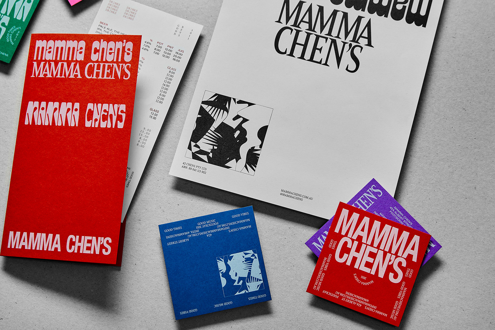
Developed a lively, inclusive brand identity for Mamma Chen's, a community-focused live music venue and bar celebrating good times, good music, and good vibes. Using Illustrator and InDesign, I design...
Print Design, Branding
/25
INSPIRATION
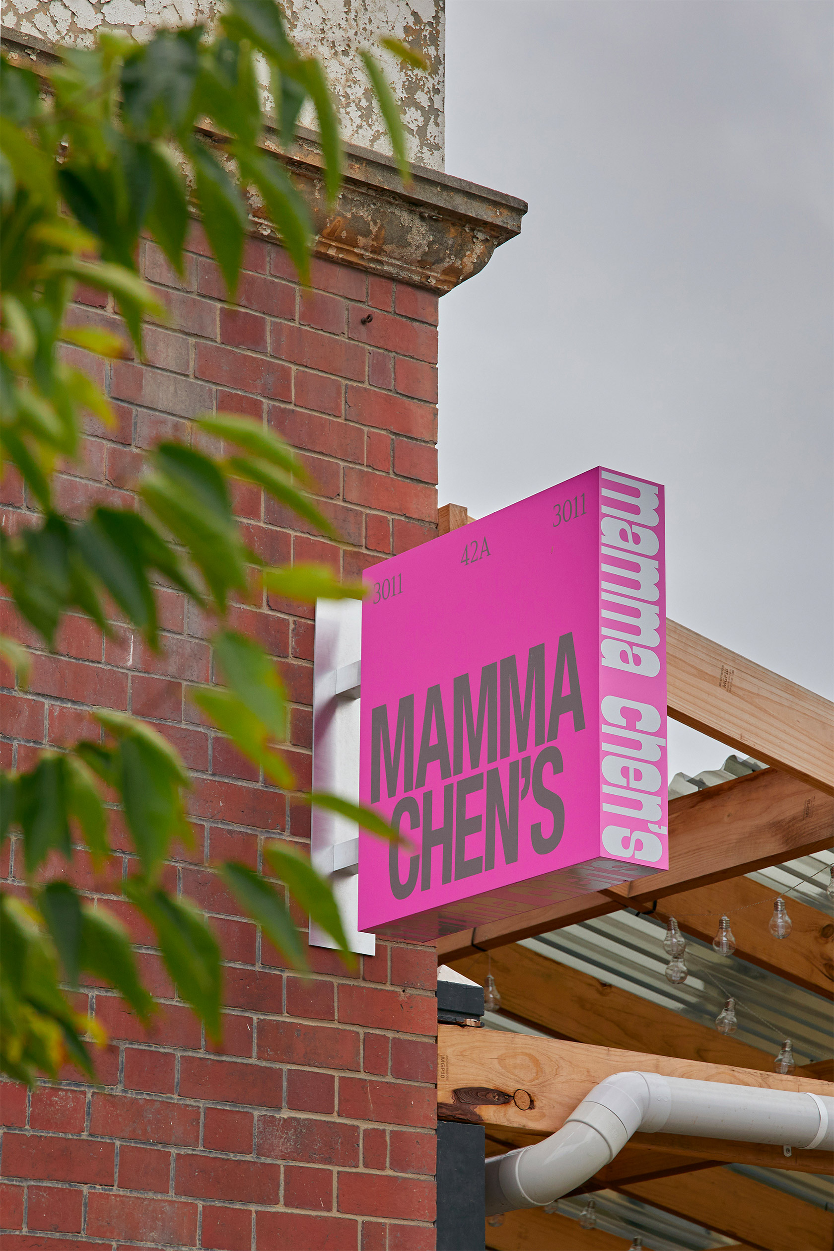
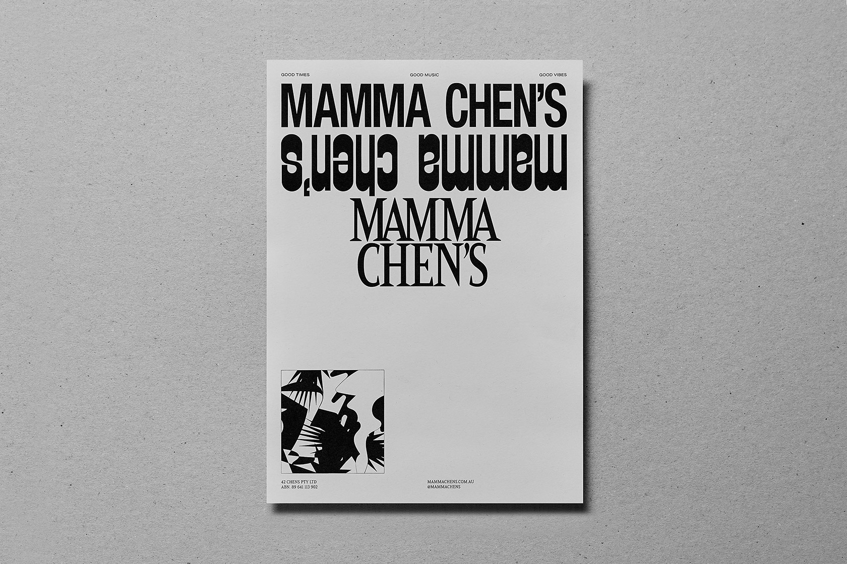
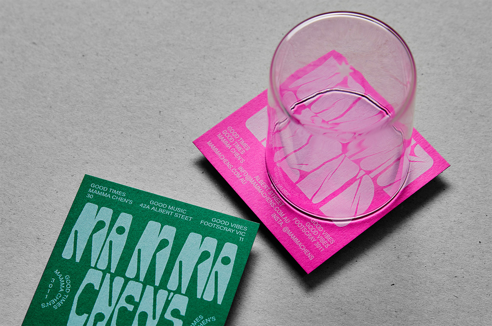
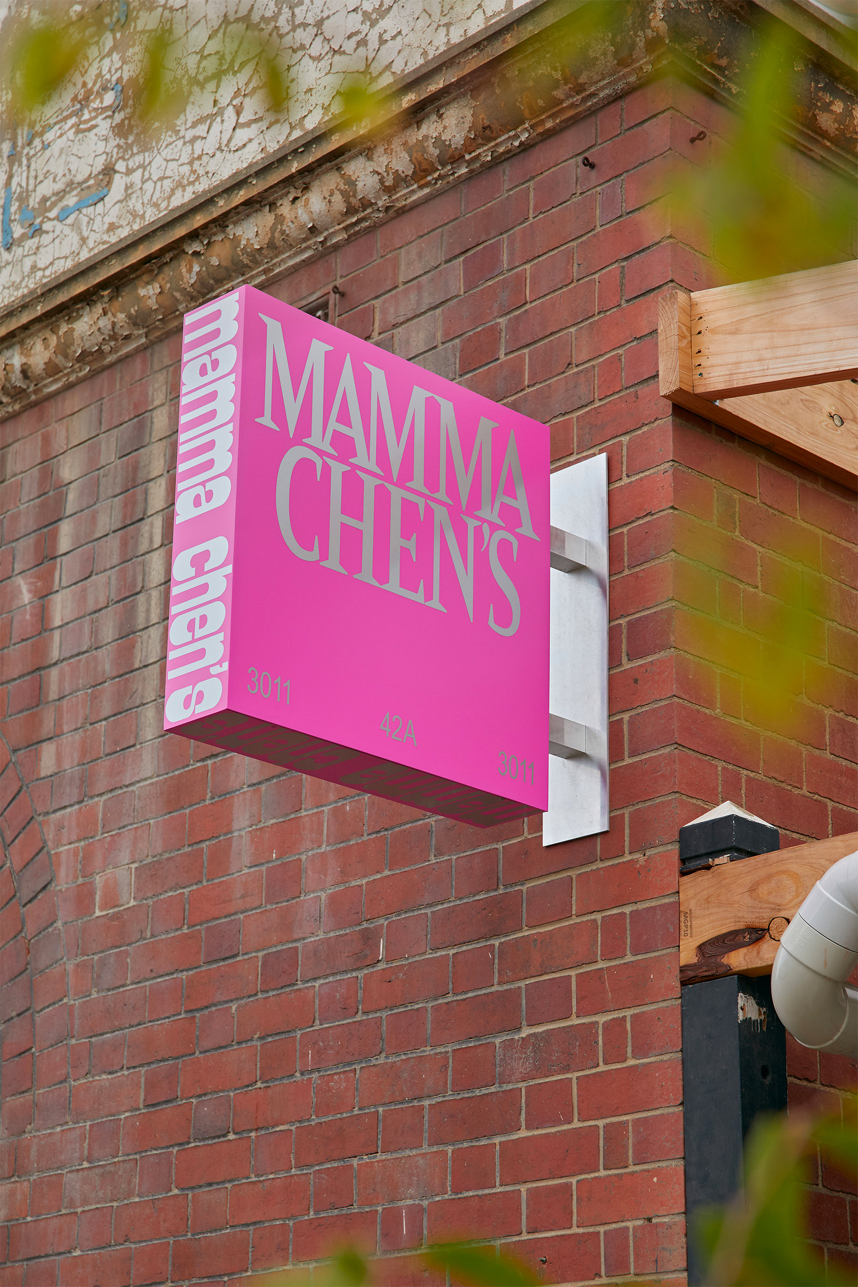
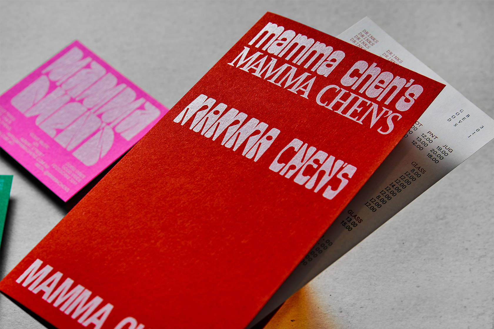
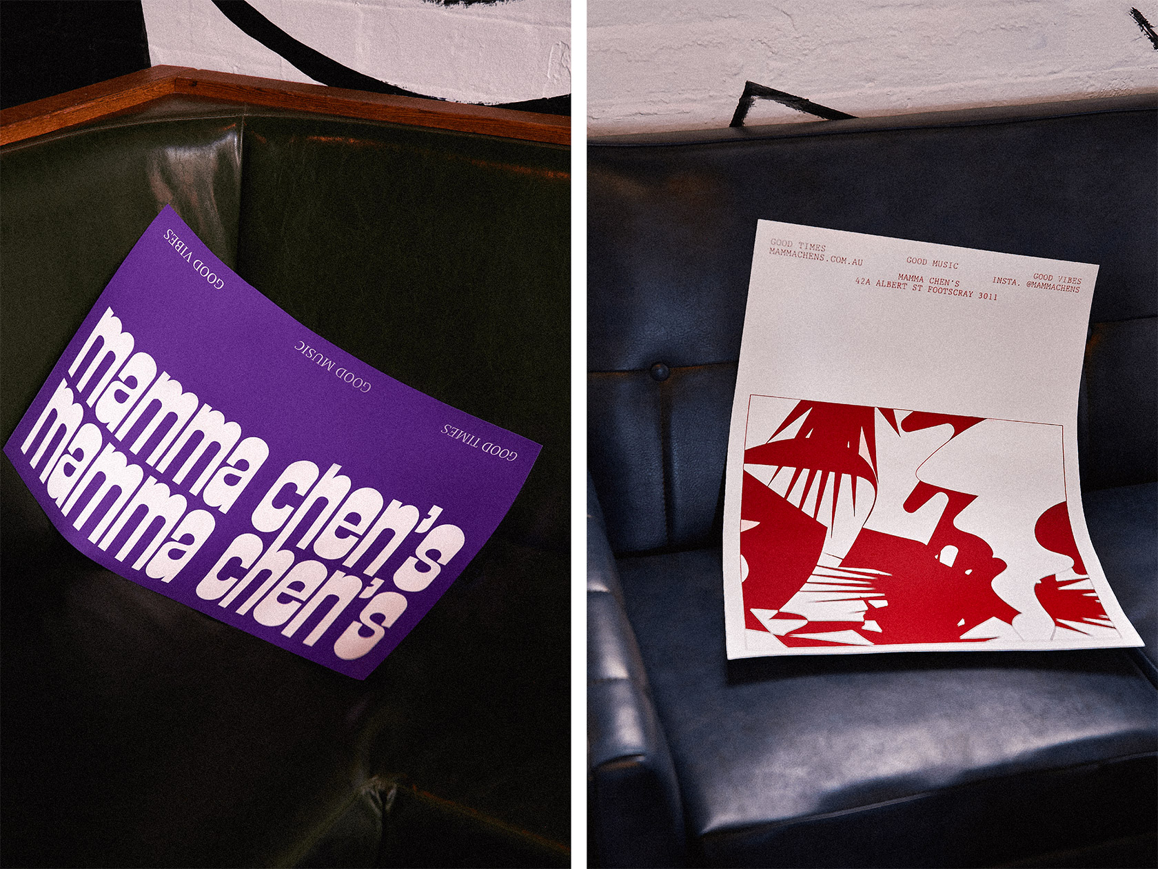
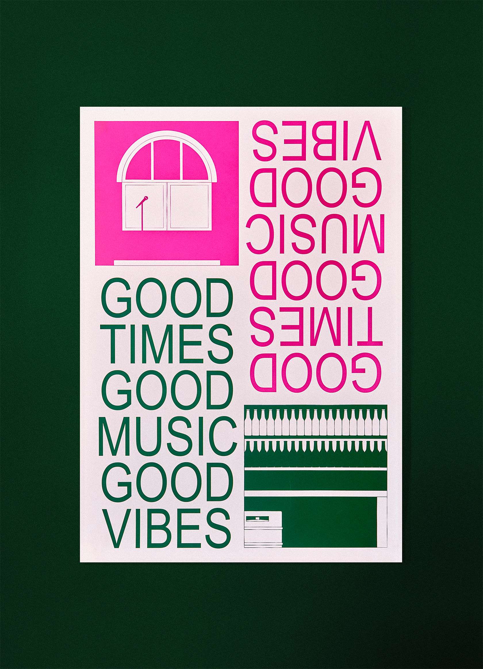
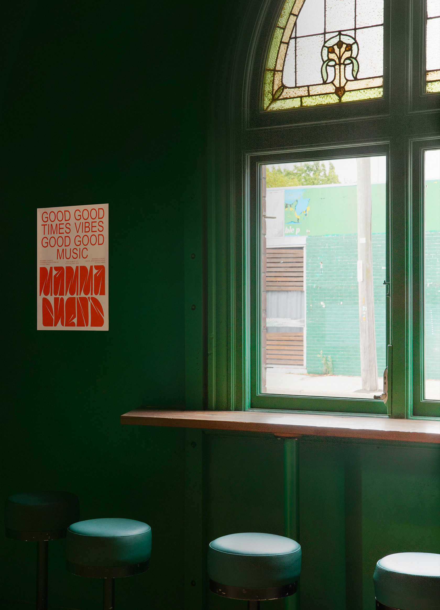
Developed a lively, inclusive brand identity for Mamma Chen's, a community-focused live music venue and bar celebrating good times, good music, and good vibes. Using Illustrator and InDesign, I designed a vibrant visual system — including the main logo, supporting graphics, and a vivid color palette — to reflect the venue's welcoming, eclectic, and inclusive spirit. I also created a suite of print and stationery materials (menus, posters/flyers, packaging/promotional collateral) that embody the venue's energy and community-centered ethos. The final branding supports Mamma Chen's mission to be a warm, accessible space for music and people, giving the venue a consistent and memorable visual presence across print and physical touchpoints.
message
Fun colors and shapes can change our perception of mistakes. Thanks to the Space Grotesk typeface, designed by Florian Karsten in 2018 and featuring numerous stylistic sets, we can see how typographic glyphs themselves are shapes resulting from years and years of mistakes and failed attempts to make writing more beautiful, faster, more readable, or more original.
Premium, but not snobbish
Starting with a very strong graphic concept, a parallel growth, the line becomes the protagonist of the visual identity. A line that grows, connects and marks a path both for the eye and the mind.